|
|
Post by 50tbrd on Dec 11, 2013 10:07:16 GMT -5
|
|
|
|
Post by Rapetou33 on Dec 11, 2013 10:55:24 GMT -5
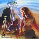
Jason's ?  |
|
|
|
Post by VectorX on Dec 11, 2013 11:08:42 GMT -5
Neat, they went to a fair amount of trouble on the Protector one with all the different colors for the player's reserve area (smart bombs, ships left, etc.)!
|
|
|
|
Post by TrekMD on Dec 11, 2013 11:35:45 GMT -5
That looks fantastic!
|
|
|
|
Post by jasonbar on Dec 11, 2013 11:57:59 GMT -5
|
|
|
|
Post by 50tbrd on Dec 11, 2013 12:08:22 GMT -5
Its from your auction, Jason and they were available originally from vectrexoverlays.com but Edward got those overlay designs from all over. As cool a service as it is/was, the artists never got credit and probably never got any compensation for their work either.
|
|
|
|
Post by VectorX on Dec 11, 2013 12:51:29 GMT -5
A lot of people don't anyway, even several programmers (Ville/Thrust, Aker/Revector, Nebula Commander, Ronen/Vaboom!/Vectrace, etc.) gave away their games for free to be included on multicarts and all.
|
|
|
|
Post by 50tbrd on Dec 11, 2013 13:19:33 GMT -5
Programmers will always get credit, their names are programmed into the game. And while current multicarts probably don't have the permission of the original programmers, I believe Sean Kelly and some of the older ones did.
There is definitely a departure from the original spirit of the Vectrex homebrew. Nothing is made at cost anymore or for minimum wage/labor (like Sean, John and Madtronics did/do) and very few people donate their time and designs for the community.
|
|
|
|
Post by jasonbar on Dec 11, 2013 13:19:44 GMT -5
I recall Ed saying that he went to efforts to contact artists & get permission where he could. Where he couldn't I believe he redesigned the art.
These claims are from my memory only & Ed's words can probably be mined from his thread(s) on Atari Age, if you wish to dig deeper.
Thanks,
-Jason
|
|
|
|
Post by 50tbrd on Dec 12, 2013 19:27:45 GMT -5
Some of them I'm sure that he replicated himself but they're still someone else's design. I could just as easily make a completely awesome alternate design and I'd be the only one who had that design to sell which gives me a draw. I have a hard time leaving the things the original designs alone, I think of things that can make them more dynamic, more bold or in some cases just more uniform. Design of the letters is a big deal. I see they use two Es and they're not the same or there's an E and an L and the bottoms of both don't line up. This is actually why its going to be Protector 2.0. I'm making a lot of changes.
|
|
|
|
Post by VectorX on Dec 12, 2013 23:18:33 GMT -5
Sounds good :-)
|
|
|
|
Post by 50tbrd on Jan 22, 2014 14:57:30 GMT -5
Finished the design for Protector 2.0. I eyeballed the first Protector logo and decided to redo it before I let everyone see the changes I made. The 1.9 design is pretty faithful to the design that I think Mark Desmet did with the exception of the logo and the 2.1 design is whatever I thought looked best and only uses 4 colors. Protector 1.9 Overlay.pdf (10.13 KB) Protector 2.1 Overlay.pdf (11 KB) For private use only. Not to be used for commercial purposes without my expressed permission. |
|
|
|
Post by xefned on Jan 25, 2014 15:16:59 GMT -5
Beautiful work! Thanks for sharing!
|
|
|
|
Post by TrekMD on Jan 25, 2014 21:16:30 GMT -5
Agreed, that looks excellent!
|
|
|
|
Post by xefned on Jun 4, 2014 10:35:51 GMT -5
Wow again. True vector designs! I just zoomed way the frick in. Nice. Any other overlay projects on the horizon?
|
|